티스토리 뷰
ListView에 View 프로퍼티에 넣어서 사용할 CustomView를 만들고, 사용하는 방법에 대해서 알아 보겠습니다.
Microsoft Docs에 있는 문서를 보시려면 여기를 참고하시기 바랍니다.
1. PlainView Custom Control 추가하기
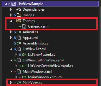
프로젝트 팝업 메뉴 -> Add -> New Item -> WPF -> Custom Control(WPF)를 선택 후 Name에 PlainView를 입력하고 Add를 클릭합니다.

빨간 테두리 부분의 Themes/Generic.xaml과 PlainView.cs 파일이 추가됩니다.
이전 포스트에서 리소스 딕셔너리는 App.xaml에서 연결시켜 주어야 하지만, Generic.xaml은 그렇게 할 필요가 없이 자동으로 프로젝트에 로딩 됩니다.
2. PlainView.cs 수정
우리가 만들어야 하는것은 콤포넌트로 컨트롤 보다 더 작은 녀석 입니다. 그래서, Custom Control 만드는 방법과는 많이 다르니 천천히 따라 만듭니다.
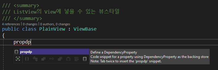
Control를 ViewBase로 변경합니다. ListView의 View 프로퍼티에 넣을 수 있는 컨트롤은 ViewBase이기 때문입니다.
ViewBase 컨트롤에는 DefaultStyleKey를 override해서 선언해야 하는데, 이 때 ComponentResourceKey를 이용합니다.
ComponentResourceKey 대한 자세한 설명은 여기를 참고 합니다.
    /// <summary>
    /// ListView의 View에 넣을 수 있는 뷰스타일
    /// </summary>
    public class PlainView : ViewBase
    {
        /// <summary>
        /// 기본 스타일 키 설정
        /// </summary>
        protected override object DefaultStyleKey
        {
            get
            {
                //PlainView DefaultStyleKey
                return new ComponentResourceKey(GetType(), "PlainViewDSK");
            }
        }
    }
propdp를 입력하고 tab키를 두번 눌러 DependencyProperty를 추가합니다.
int를 Style로 변경하고 tab키를 눌러서 이름을 ItemContainerStyle로 변경하고, tab을 누르고 엔터를 입력해서 수정을 완료합니다. 일반적인 DependencyProperty는 여기서 끝인데...

DependencyProperty.Register(........) 부분을 ItemsControl.ItemContainerStyleProperty.AddOwner(typeof(PlainView))로 변경합니다. 이렇게 수정하면, DependencyProperty를 PlainView 컨트롤의 ItemContainerStyle과 연결하겠다는 것입니다.
이렇게 나머지 DependencyProperty를 추가해서 완성 시킵니다.
        public Style ItemContainerStyle
        {
            get { return (Style)GetValue(ItemContainerStyleProperty); }
            set { SetValue(ItemContainerStyleProperty, value); }
        }

        /// <summary>
        /// ItemsControl.ItemContainerStyle를 PlainView를 추가합니다.
        /// </summary>
        public static readonly DependencyProperty ItemContainerStyleProperty =
            ItemsControl.ItemContainerStyleProperty.AddOwner(typeof(PlainView));
최종 완성된 PlainView.cs 입니다.
using System.Windows;
using System.Windows.Controls;

namespace ListViewSample
{
    /// <summary>
    /// ListView의 View에 넣을 수 있는 뷰스타일
    /// </summary>
    public class PlainView : ViewBase
    {
        public Style ItemContainerStyle
        {
            get { return (Style)GetValue(ItemContainerStyleProperty); }
            set { SetValue(ItemContainerStyleProperty, value); }
        }

        /// <summary>
        /// ItemsControl.ItemContainerStyle를 PlainView를 추가합니다.
        /// </summary>
        public static readonly DependencyProperty ItemContainerStyleProperty =
            ItemsControl.ItemContainerStyleProperty.AddOwner(typeof(PlainView));

        public DataTemplate ItemTemplate
        {
            get { return (DataTemplate)GetValue(ItemTemplateProperty); }
            set { SetValue(ItemTemplateProperty, value); }
        }

        /// <summary>
        /// ItemsControl.ItemTemplateProperty를 PlainView에 추가합니다.
        /// </summary>
        public static readonly DependencyProperty ItemTemplateProperty =
            ItemsControl.ItemTemplateProperty.AddOwner(typeof(PlainView));

        public double ItemWidth
        {
            get { return (double)GetValue(ItemWidthProperty); }
            set { SetValue(ItemWidthProperty, value); }
        }

        /// <summary>
        /// WrapPanel.ItemWidthProperty를 PlainView에 추가합니다.
        /// </summary>
        public static readonly DependencyProperty ItemWidthProperty =
            WrapPanel.ItemWidthProperty.AddOwner(typeof(PlainView));

        public double ItemHeight
        {
            get { return (double)GetValue(ItemHeightProperty); }
            set { SetValue(ItemHeightProperty, value); }
        }

        /// <summary>
        /// WrapPanel.ItemHeightProperty를 PlainView에 추가합니다.
        /// </summary>
        public static readonly DependencyProperty ItemHeightProperty =
            WrapPanel.ItemHeightProperty.AddOwner(typeof(PlainView));

        /// <summary>
        /// 기본 스타일 키 설정
        /// </summary>
        protected override object DefaultStyleKey
        {
            get
            {
                //PlainView DefaultStyleKey
                return new ComponentResourceKey(GetType(), "PlainViewDSK");
            }
        }
    }
}
3. Generic.xaml 수정
기존에 등록되어 있던 Style를 아래와 같이 수정합니다. 이 스타일은 ListView를 대상으로 하며, 기본 스타일은 ListBox의 스타일에서 상속 받습니다. x:Key는 위에서 선언했던, ComponentResourceKey를 이용합니다.
    <Style x:Key="{ComponentResourceKey TypeInTargetAssembly={x:Type local:PlainView},
                                        ResourceId=PlainViewDSK}"
           TargetType="{x:Type ListView}"
           BasedOn="{StaticResource {x:Type ListBox}}">

    </Style>
ItemContainerStyle을 추가하도록 하겠습니다.
아래와 같이 추가하면, ListView에 있는 ItemsContainerStyle을 PlainView.cs에 있는 ItemsContainerStyle DependencyProperty와 연결이 됩니다.
<Setter Property="ItemContainerStyle" Value="{Binding RelativeSource={RelativeSource Mode=Self}, Path=View.ItemTemplate}" />ItemTemplate도 추가합니다.
Value에 Binding 할때 아래 순서대로 입력하면 약간 인텔리센스가 나오는데, View.ItemTemplate 에서 ItemTemplate는 인텔리센스가 나오지 않으니 참고하시기 바랍니다.
<Setter Property="ItemTemplate" Value="{Binding RelativeSource={RelativeSource Mode=Self}, Path=View.ItemTemplate}" />ItemsPanel을 속성을 변경합니다.
기존 ListBox의 ItemsPanel에는 StackPanel이 들어가있는데, 이 것을 WrapPanel로 수정하고, Width, MinWidth, ItemHeight, ItemWidth를 View에 속성과 연결시켜 줍니다.
        <Setter Property="ItemsPanel">
            <Setter.Value>
                <ItemsPanelTemplate>
                    <WrapPanel
                        Width="{Binding RelativeSource={RelativeSource AncestorType=ScrollContentPresenter}, Path=ActualWidth}"
                        MinWidth="{Binding RelativeSource={RelativeSource AncestorType=ListView}, Path=View.ItemWidth}"
                        ItemHeight="{Binding RelativeSource={RelativeSource AncestorType=ListView}, Path=View.ItemHeight}"
                        ItemWidth="{Binding RelativeSource={RelativeSource AncestorType=ListView}, Path=View.ItemWidth}" />
                </ItemsPanelTemplate>
            </Setter.Value>
        </Setter>
최종 Generic.xaml은 아래와 같습니다.
<ResourceDictionary
    xmlns="http://schemas.microsoft.com/winfx/2006/xaml/presentation"
    xmlns:x="http://schemas.microsoft.com/winfx/2006/xaml"
    xmlns:local="clr-namespace:ListViewSample">

    <!--  PlainView Default Style for ListView  -->
    <Style
        x:Key="{ComponentResourceKey TypeInTargetAssembly={x:Type local:PlainView},
                                     ResourceId=PlainViewDSK}"
        BasedOn="{StaticResource {x:Type ListBox}}"
        TargetType="{x:Type ListView}">

        <Setter Property="HorizontalContentAlignment" Value="Stretch" />
        <Setter Property="ItemTemplate" Value="{Binding RelativeSource={RelativeSource Mode=Self}, Path=View.ItemTemplate}" />
        <Setter Property="ItemContainerStyle" Value="{Binding RelativeSource={RelativeSource Mode=Self}, Path=View.ItemContainerStyle}" />
        <Setter Property="ItemsPanel">
            <Setter.Value>
                <ItemsPanelTemplate>
                    <WrapPanel
                        Width="{Binding RelativeSource={RelativeSource AncestorType=ScrollContentPresenter}, Path=ActualWidth}"
                        MinWidth="{Binding RelativeSource={RelativeSource AncestorType=ListView}, Path=View.ItemWidth}"
                        ItemHeight="{Binding RelativeSource={RelativeSource AncestorType=ListView}, Path=View.ItemHeight}"
                        ItemWidth="{Binding RelativeSource={RelativeSource AncestorType=ListView}, Path=View.ItemWidth}" />
                </ItemsPanelTemplate>
            </Setter.Value>
        </Setter>
    </Style>

</ResourceDictionary>
4. ListViewCustomView.xaml
Window.Resources에 2개의 PlainView를 추가합니다.
tileView에는 ItemWidth를 100으로 정하고, ItemTemplate에 StackPanel을 사용해서 만들어 줍니다.
iconView는 ItemWidth를 150으로 정하고, DockPanel을 이용해서 ItemTemplate를 만들어 줍니다.
        <local:PlainView x:Key="tileView" ItemWidth="100">
            <local:PlainView.ItemTemplate>
                <DataTemplate>
                    <StackPanel Width="90" Height="100">
                        <Border
                            Width="70"
                            Height="70"
                            HorizontalAlignment="Center"
                            Background="Gray">
                            <Image Margin="6,6,6,9" Source="{Binding ImagePath}" />
                        </Border>
                        <TextBlock
                            Margin="0,0,0,1"
                            HorizontalAlignment="Center"
                            FontSize="13"
                            Text="{Binding Name}" />
                        <TextBlock
                            Margin="0,0,0,1"
                            HorizontalAlignment="Center"
                            FontSize="9"
                            Text="{Binding Type}" />
                    </StackPanel>
                </DataTemplate>
            </local:PlainView.ItemTEmplate>
        </local:PlainView>

        <local:PlainView x:Key="iconView" ItemWidth="150">
            <local:PlainView.ItemTemplate>
                <DataTemplate>
                    <DockPanel Width="150">
                        <Border Background="Gray">
                            <Image
                                Width="32"
                                Height="32"
                                Margin="2"
                                Source="{Binding ImagePath}" />
                        </Border>
                        <TextBlock
                            Margin="2,0,0,1"
                            HorizontalAlignment="Left"
                            DockPanel.Dock="Top"
                            FontSize="13"
                            Text="{Binding Name}" />
                        <TextBlock
                            Margin="2,0,0,1"
                            HorizontalAlignment="Left"
                            FontSize="9"
                            Text="{Binding Type}" />
                    </DockPanel>
                </DataTemplate>
            </local:PlainView.ItemTEmplate>
        </local:PlainView>
5. ListViewCustomView.xaml 의 전체 소스
<Window
    x:Class="ListViewSample.ListViewCustomView"
    xmlns="http://schemas.microsoft.com/winfx/2006/xaml/presentation"
    xmlns:x="http://schemas.microsoft.com/winfx/2006/xaml"
    xmlns:d="http://schemas.microsoft.com/expression/blend/2008"
    xmlns:local="clr-namespace:ListViewSample"
    xmlns:mc="http://schemas.openxmlformats.org/markup-compatibility/2006"
    Title="ListViewCustomView"
    Width="800"
    Height="450"
    Loaded="Window_Loaded"
    mc:Ignorable="d">
    <Window.Resources>
        <GridView x:Key="gridView">
            <GridViewColumn Header="Check">
                <GridViewColumn.CellTemplate>
                    <DataTemplate>
                        <CheckBox IsChecked="{Binding IsChecked, Mode=TwoWay}" />
                    </DataTemplate>
                </GridViewColumn.CellTemplate>
            </GridViewColumn>
            <GridViewColumn DisplayMemberBinding="{Binding Name}" Header="Name" />
            <GridViewColumn DisplayMemberBinding="{Binding Type}" Header="Type" />
            <GridViewColumn Header="Image">
                <GridViewColumn.CellTemplate>
                    <DataTemplate>
                        <Border Background="Gray">
                            <Image
                                Width="32"
                                Height="32"
                                Source="{Binding ImagePath}" />
                        </Border>
                    </DataTemplate>
                </GridViewColumn.CellTemplate>
            </GridViewColumn>
        </GridView>

        <local:PlainView x:Key="tileView" ItemWidth="100">
            <local:PlainView.ItemTemplate>
                <DataTemplate>
                    <StackPanel Width="90" Height="100">
                        <Border
                            Width="70"
                            Height="70"
                            HorizontalAlignment="Center"
                            Background="Gray">
                            <Image Margin="6,6,6,9" Source="{Binding ImagePath}" />
                        </Border>
                        <TextBlock
                            Margin="0,0,0,1"
                            HorizontalAlignment="Center"
                            FontSize="13"
                            Text="{Binding Name}" />
                        <TextBlock
                            Margin="0,0,0,1"
                            HorizontalAlignment="Center"
                            FontSize="9"
                            Text="{Binding Type}" />
                    </StackPanel>
                </DataTemplate>
            </local:PlainView.ItemTemplate>
        </local:PlainView>

        <local:PlainView x:Key="iconView" ItemWidth="150">
            <local:PlainView.ItemTemplate>
                <DataTemplate>
                    <DockPanel Width="150">
                        <Border Background="Gray">
                            <Image
                                Width="32"
                                Height="32"
                                Margin="2"
                                Source="{Binding ImagePath}" />
                        </Border>
                        <TextBlock
                            Margin="2,0,0,1"
                            HorizontalAlignment="Left"
                            DockPanel.Dock="Top"
                            FontSize="13"
                            Text="{Binding Name}" />
                        <TextBlock
                            Margin="2,0,0,1"
                            HorizontalAlignment="Left"
                            FontSize="9"
                            Text="{Binding Type}" />
                    </DockPanel>
                </DataTemplate>
            </local:PlainView.ItemTemplate>
        </local:PlainView>
    </Window.Resources>

    <Grid>
        <Grid.RowDefinitions>
            <RowDefinition Height="Auto" />
            <RowDefinition />
        </Grid.RowDefinitions>
        <Grid.ColumnDefinitions>
            <ColumnDefinition />
            <ColumnDefinition />
        </Grid.ColumnDefinitions>
        <StackPanel Orientation="Horizontal">
            <RadioButton
                x:Name="Default"
                Margin="5"
                Checked="Default_Checked"
                Content="GridView" />
            <RadioButton
                Margin="5"
                Checked="Default_Checked"
                Content="TileView" />
            <RadioButton
                Margin="5"
                Checked="Default_Checked"
                Content="IconView" />
        </StackPanel>

        <ListView x:Name="ListView" Grid.Row="1" />
    </Grid>
</Window>
6. ListViewCustomView.xaml.cs의 전체 소스
RadioButton을 선택할 때 발생하는 IsChecked 이벤트가 발생하면 Default_Checked 이벤트 핸들러가 실행되면서 ListView.View에 gridView, tileView, iconView를 선택적으로 입력해서 형태를 변경합니다.
using System.Collections.Generic;
using System.Windows;
using System.Windows.Controls;

namespace ListViewSample
{
    /// <summary>
    /// Interaction logic for ListViewCustomView.xaml
    /// </summary>
    public partial class ListViewCustomView : Window
    {
        private List<Animal> _list;

        public ListViewCustomView()
        {
            InitializeComponent();

            _list = new List<Animal>
            {
                new Animal { IsChecked=true, Name = "Cat",  Type = "animal", ImagePath = @"Images\cat.png"},
                new Animal { IsChecked=false, Name = "Dog",  Type = "animal", ImagePath = @"Images\dog.png"},
                new Animal { IsChecked=true, Name = "Fish",  Type = "fish", ImagePath = @"Images\fish.png"},
                new Animal { IsChecked=false, Name = "Flower",  Type = "plant", ImagePath = @"Images\flower.jpg"},
            };
        }

        private void Window_Loaded(object sender, RoutedEventArgs e)
        {
            ListView.ItemsSource = _list;
            //GridView 스타일을 기본으로 시작
            Default.IsChecked = true;
        }

        private void Default_Checked(object sender, RoutedEventArgs e)
        {
            var button = (RadioButton)sender;
            switch (button.Content.ToString())
            {
                case "GridView":
                    ListView.View = Resources["gridView"] as ViewBase;
                    break;
                case "TileView":
                    ListView.View = Resources["tileView"] as ViewBase;
                    break;
                case "IconView":
                    ListView.View = Resources["iconView"] as ViewBase;
                    break;
            }
        }
    }
}
7. 실행 결과
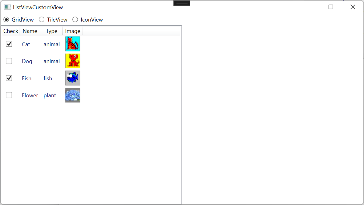
윈도우 탐색기의 보기 형태를 변경하는 것과 같은 효과를 줄 수 있습니다.
GridView
TileView
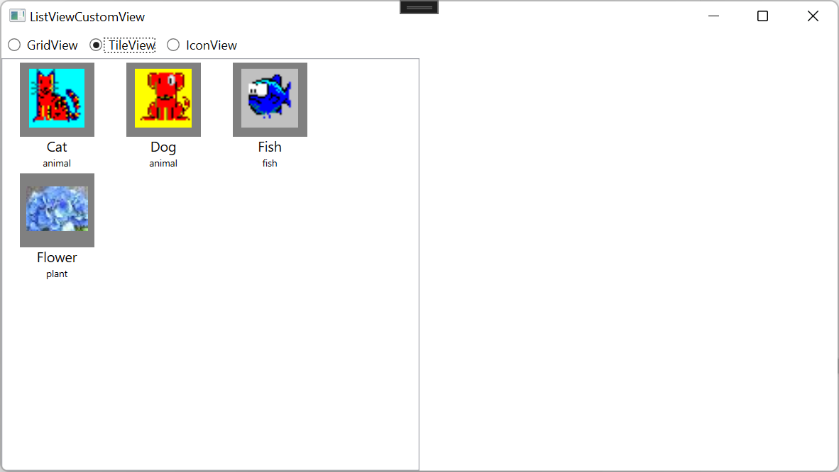
IconView

8. 소스
WpfTest/ListViewSample at master · kaki104/WpfTest (github.com)
GitHub - kaki104/WpfTest
Contribute to kaki104/WpfTest development by creating an account on GitHub.
github.com
'WPF .NET' 카테고리의 다른 글
| DataGrid에 Row번호를 출력하기 (1) | 2022.02.23 |
|---|---|
| Microsoft.Toolkit.Mvvm을 이용한 간단한 프레임워크 part1 (11) | 2022.02.21 |
| ListBox, DataGrid, ListView 차이점 비교 (1) | 2022.02.16 |
| ResourceDictionary 사용하기 (활용편) (1) | 2022.02.11 |
| ResourceDictionary 사용하기 (기본편) (0) | 2022.01.27 |
- Total
- Today
- Yesterday
- C#
- windows 11
- Bot Framework
- .net 5.0
- MVVM
- .net
- Build 2016
- Microsoft
- uno-platform
- UWP
- dotNETconf
- Cross-platform
- WPF
- XAML
- visual studio 2019
- #uwp
- uno platform
- #prism
- ComboBox
- ef core
- Windows 10
- PRISM
- Visual Studio 2022
- IOT
- Always Encrypted
- kiosk
- #MVVM
- Behavior
- LINQ
- #Windows Template Studio
| 일 | 월 | 화 | 수 | 목 | 금 | 토 |
|---|---|---|---|---|---|---|
| 1 | 2 | 3 | 4 | 5 | 6 | 7 |
| 8 | 9 | 10 | 11 | 12 | 13 | 14 |
| 15 | 16 | 17 | 18 | 19 | 20 | 21 |
| 22 | 23 | 24 | 25 | 26 | 27 | 28 |