티스토리 뷰
2022.09.06 - [WPF .NET] - MVVM Pattern을 사용하는 개발자를 위한 안내v1.0 part9-2 StyleSelector
2022.08.31 - [WPF .NET] - MVVM Pattern을 사용하는 개발자를 위한 안내 v1.0 part9-1 DataTemplateSelector
2022.08.08 - [WPF .NET] - MVVM Pattern을 사용하는 개발자를 위한 안내 v1.0 part8-3 Template
2022.08.02 - [WPF .NET] - MVVM Pattern을 사용하는 개발자를 위한 안내 v1.0 part8-2 Template
2022.07.21 - [WPF .NET] - MVVM Pattern을 사용하는 개발자를 위한 안내 v1.0 part8-1 Template
2022.07.13 - [WPF .NET] - MVVM Pattern을 사용하는 개발자를 위한 안내 v1.0 part7 Behavior
2022.07.05 - [WPF .NET] - MVVM Pattern을 사용하는 개발자를 위한 안내 V1.0 part6 Command
2022.06.27 - [WPF .NET] - MVVM Pattern을 사용하는 개발자를 위한 안내 V1.0 part5 Converter
2022.06.15 - [WPF .NET] - MVVM Pattern을 사용하는 개발자를 위한 안내 V1.0 part4-2 Data Binding
2022.06.13 - [WPF .NET] - MVVM Pattern을 사용하는 개발자를 위한 안내 V1.0 part4-1 Data Binding
2022.06.07 - [WPF .NET] - MVVM Pattern을 사용하는 개발자를 위한 안내 V1.0 part3-3
2022.06.02 - [WPF .NET] - MVVM Pattern을 사용하는 개발자를 위한 안내 V1.0 part3-2
2022.05.30 - [WPF .NET] - MVVM Pattern을 사용하는 개발자를 위한 안내 V1.0 part3-1
2022.05.11 - [WPF .NET] - MVVM Pattern을 사용하는 개발자를 위한 안내 v1.0 part2
2022.05.09 - [WPF .NET] - MVVM Pattern을 사용하는 개발자를 위한 안내 v1.0 part1

1. ElementName을 바인딩 원본으로 사용하기
- 다른 컨트롤의 x:Name을 사용해서 대상 객체로 지정하고, 프로퍼티를 사용합니다.
- 속성 값 상속 기능이 적용되지 않습니다.
- 컨트롤의 SelectedItem, DataContext를 사용해서 더 자세한 프로퍼티를 지정할 수 있습니다.
- SelectedItem.Id
- SelectedItem이 Person 객체가 들어가 있다면, Person의 Id 프로퍼티를 사용할 수 있습니다.
- DataContext.People
- DataContext가 MainViewModel 객체가 들어가 있다면, People 프로퍼티를 사용할 수 있습니다..
- SelectedItem.Id
- 자세한 설명은 여기를 참고하시기 바랍니다.
다른 컨트롤의 프로퍼티를 사용
- AgeSlider라는 이름의 Slider 컨트롤이 있습니다.
- <TextBlock Text="{Binding ElementName=AgeSlider, Path=Value, StringFormat={}{0:N0}}" />
- TextBlock 컨트롤의 Text 프로퍼티에 AgeSlider 컨트롤의 Value 프로퍼티를 바인딩하며, 정수만 보이도록 StringFormat을 추가했습니다.
- StringFormat은 WPF에서만 사용 가능합니다.
- <Run Text="{Binding ElementName=LeftStackPanel, Path=ActualWidth, Mode=OneWay, StringFormat={}{0:N0}}" />
- Run 컨트롤의 Text 프로퍼티에 LeftStackPanel컨트롤의 ActualWidth 프로퍼티를 바인딩합니다.
<StackPanel x:Name="LeftStackPanel" Margin="10">
    <Slider
        x:Name="AgeSlider"
        Maximum="100"
        Minimum="1" />
    <TextBlock Text="Age" />
    <TextBlock Text="{Binding ElementName=AgeSlider, Path=Value, StringFormat={}{0:N0}}" />
    <TextBlock Text="LeftStackPanel Size" />
    <TextBlock>
        <Run Text="{Binding ElementName=LeftStackPanel, Path=ActualWidth, Mode=OneWay, StringFormat={}{0:N0}}" />
        :<Run Text="{Binding ElementName=LeftStackPanel, Path=ActualHeight, Mode=OneWay, StringFormat={}{0:N0}}" />
    </TextBlock>
</StackPanel>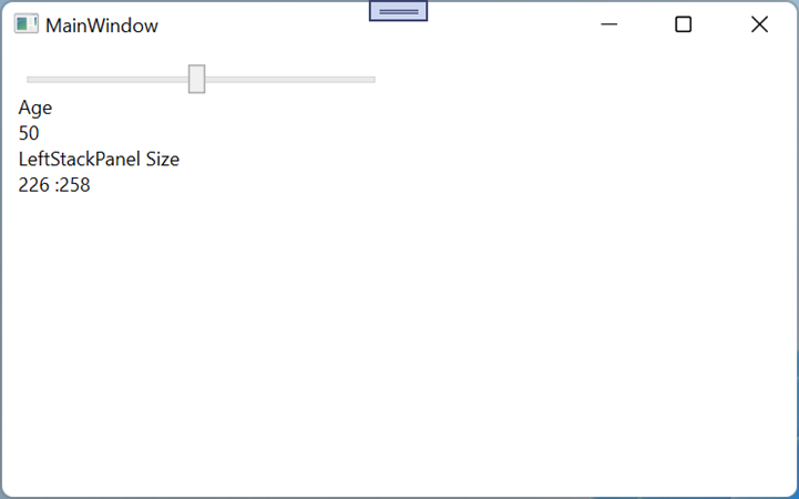
ListBox의 SelectedItem 프로퍼티에 들어가있는 모델의 프로퍼티를 사용
- <TextBlock Text="{Binding ElementName=AgeSlider, Path=Value, StringFormat={}{0:N0}}" />
- DataTemplate 내부에서도 외부에 있는 AgeSlider 컨트롤을 바인딩 원본으로 지정해서 사용할 수 있습니다.
- <TextBlock Text="{Binding ElementName=PeopleList, Path=SelectedItem.Id}" />
- TextBlock 컨트롤의 Text 프로퍼티에 PeopleList 컨트롤의 SelectedItem의 Id를 바인딩 합니다. 즉, Person.Id를 바인딩하는 것과 동일합니다.
<ListBox x:Name="PeopleList" ItemsSource="{Binding People}">
    <ListBox.ItemTemplate>
        <DataTemplate>
            <StackPanel Orientation="Horizontal">
                <TextBlock Text="{Binding ElementName=AgeSlider, Path=Value, StringFormat={}{0:N0}}" />
                <TextBlock Margin="5,0" Text="{Binding Id}" />
                <TextBlock Margin="5,0" Text="{Binding Name}" />
                <TextBlock Margin="5,0" Text="{Binding Sex}" />
            </StackPanel>
        </DataTemplate>
    </ListBox.ItemTemplate>
</ListBox>
<TextBlock Text="Selected Item" />
<TextBlock Text="{Binding ElementName=PeopleList, Path=SelectedItem.Id}" />
<TextBlock Text="{Binding ElementName=PeopleList, Path=SelectedItem.Name}" />
<TextBlock Text="{Binding ElementName=PeopleList, Path=SelectedItem.Sex}" />
2. Source를 바인딩 원본으로 사용하기
- StaticResource 혹은 x:Static을 바인딩 원본으로 사용합니다.
- x:Static은 WPF에서만 사용할 수 있습니다.
- 속성 값 상속 기능이 적용되지 않습니다.
- StaticResource는 Resource나 일반 객체에 비해 많은 메모리를 사용하기 때문에 적절히 사용하는 것이 좋습니다.
- 자세한 설명은 여기를 참고하시기 바랍니다.
Source를 이용해서 StaticResource 사용하기
- Window.Resources 내부에 Person 모델의 객체를 CreateUser라는 키로 생성합니다.
- 이렇게 생성된 객체는 StaticResource 키워드와 키를 이용해서 사용할 수 있습니다.
- <TextBox Text="{Binding Source={StaticResource CreateUser}, Path=Name, UpdateSourceTrigger=PropertyChanged}" />
- TextBox 컨트롤의 Text 프로퍼티에 바인딩 원본으로 StaticResource에 있는 CreateUser를 사용하고, 그 객체의 Name이라는 프로퍼티와 바인딩 합니다.
- TextBox에서 값을 수정하면 CreateUser.Name 값이 변경됩니다.
- <TextBlock Grid.Column="1" Text="{Binding Source={StaticResource CreateUser}, Path=Name}" />
- TextBlock 컨트롤의 Text 프로퍼티에 바인딩 원본으로 CreateUser를 사용하고, Name이라는 프로퍼티와 바인딩 합니다.
- 변경된 CreateUser.Name이 바로 반영됩니다.
<Window.Resources>
  <local:Person x:Key="CreateUser" Name="kaki104" Id="1" Sex="True" />
</Window.Resources>
<StackPanel Margin="10">
    <TextBlock Text="Edit Current User" />
    <TextBlock Text="{Binding Source={StaticResource CreateUser}, Path=Id}" />
    <TextBox Text="{Binding Source={StaticResource CreateUser}, Path=Name,
             UpdateSourceTrigger=PropertyChanged}" />
    <CheckBox IsChecked="{Binding Source={StaticResource CreateUser}, Path=Sex,
              Mode=TwoWay}" />
    <Grid>
        <Grid.ColumnDefinitions>
            <ColumnDefinition />
            <ColumnDefinition />
            <ColumnDefinition />
        </Grid.ColumnDefinitions>
        <TextBlock Text="{Binding Source={StaticResource CreateUser}, Path=Id}" />
        <TextBlock Grid.Column="1" Text="{Binding Source={StaticResource CreateUser},
                   Path=Name}" />
        <TextBlock Grid.Column="2" Text="{Binding Source={StaticResource CreateUser},
                   Path=Sex}" />
    </Grid>
</StackPanel>
Source를 이용해서 x:Static 사용하기
- <TextBlock Text="{Binding Source={x:Static Application.Current}, Path=MainWindow.Title}" />
- TextBlock 컨트롤의 Text 프로퍼티에 Application.Current라는 Static 프로퍼티를 바인딩 원본으로 지정하고, MainWindow.Title과 바인딩 합니다.
<StackPanel Grid.Column="1" Margin="10">
    <TextBlock Text="MainWindow Title" />
    <TextBlock Text="{Binding Source={x:Static Application.Current},
               Path=MainWindow.Title}" />
    <TextBlock Text="ShutdownMode" />
    <TextBlock Text="{Binding Source={x:Static Application.Current},
               Path=ShutdownMode}" />
</StackPanel>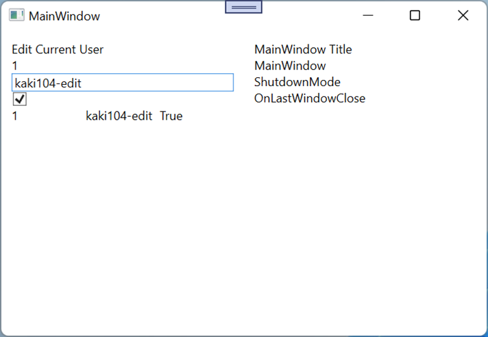
3. RelativeSource를 바인딩 원본으로 사용하기
- 바인딩 대상이 있는 위치를 기준으로 바인딩 소스를 지정하려는 경우에 사용합니다.
- 주로 Style이나 ControlTemplate를 작성할 때 사용합니다.
- VisualTree를 이해하고, 활용할 수 있을 때 사용하는 것이 좋습니다.
- 종류
- Self : 바인딩 대상이 자신의 다른 프로퍼티를 바인딩 원본으로 사용할 때 사용합니다.
- TemplateParent : ControlTemplate을 생성할 때만 사용이 가능하며, 컨트롤의 기본 값을 가져오거나 사용자가 정의한 프로퍼티 값을 가져오는 용도로 사용합니다.
- PreviousData : 이전 데이터를 이용할 때 사용할 수 있으나, 가상화를 사용하는 경우 오류가 발생할 수 있습니다.
- FindAncestor : VisualTree 상의 Parent 객체 중 원하는 Type의 대상을 지정하는데 사용하며, RelativeSource의 기본 값입니다.
- RelativeSource는 응용 레벨이 높아서 바인딩 원본 이용하는 방법에 대한 것만 포스팅 한개를 사용해야할 것 같아서 간단한 설명만으로 대신합니다. 자세한 사용법은 검색을 통해서 확인하시고 사용하시면 좋을 것 같습니다.

4. AttachedProperty를 바인딩 Path로 사용하기 - 번외편
바인딩 Path를 사용하는데 가장 난해한 것은 AttachedProperty를 바인딩하는 것이라 번외편으로 추가했습니다.
MessageExt.cs
하나의 클래스에 Message라는 AttachedProperty를 만들었습니다.
public class MessageExt
{
    public static string GetMessage(DependencyObject obj)
    {
        return (string)obj.GetValue(MessageProperty);
    }
    public static void SetMessage(DependencyObject obj, string value)
    {
        obj.SetValue(MessageProperty, value);
    }
    public static readonly DependencyProperty MessageProperty =
        DependencyProperty.RegisterAttached("Message", typeof(string), typeof(MessageExt), new PropertyMetadata(null));
}
이 클래스를 이용해서 ContentControl에 값을 입력해 보겠습니다.
- HeaderTextBox라는 이름의 TextBox의 Text 프로퍼티 값을 local:MessageExt.Message 프로퍼티에 바인딩을 합니다.
- Message라는 프로퍼티는 ContentControl을 통해서만 사용이 가능합니다.
<StackPanel Grid.Row="1">
    <TextBox x:Name="HeaderTextBox" Text="ContentControl의 해더를 입력하세요" />
    <ContentControl local:MessageExt.Message="{Binding ElementName=HeaderTextBox, Path=Text}">
        <ContentControl.Content>
            <StackPanel>
                <TextBlock Text="여기는 컨텐츠 컨트롤의 컨텐츠 영역입니다." />
            </StackPanel>
        </ContentControl.Content>
    </ContentControl>
</StackPanel>
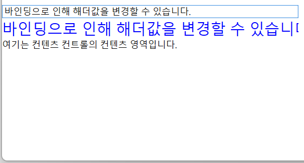
Message를 이용해서 ContentControl에 해더를 만들고, 출력하도록 Style을 작성합니다.
- Message를 이용하기 위해서는 ControlTemplate에서 사용하거나 아래와 같이 Template에서 RelativeSource={RelativeSource Mode=TemplateParent}, ... 을 이용해야 합니다.
- AttachedProperty를 Path에 사용할 때는 ()를 이용해서 표시합니다.
<Style x:Key="ContentControlStyle1" TargetType="{x:Type ContentControl}">
    <Setter Property="Template">
        <Setter.Value>
            <ControlTemplate TargetType="{x:Type ContentControl}">
                <Grid>
                    <Grid.RowDefinitions>
                        <RowDefinition Height="Auto" />
                        <RowDefinition />
                    </Grid.RowDefinitions>
                    <TextBlock
                        FontSize="20"
                        Foreground="Blue"
                        Text="{Binding RelativeSource={RelativeSource Mode=TemplatedParent}, Path=(local:MessageExt.Message)}" />
                    <ContentPresenter Grid.Row="1" />
                </Grid>
            </ControlTemplate>
        </Setter.Value>
    </Setter>
</Style>
방금 만든 Style을 ContentControl의 Style에 적용합니다.
<ContentControl local:MessageExt.Message="{Binding ElementName=HeaderTextBox, Path=Text}"
                Style="{StaticResource ContentControlStyle1}">
    <ContentControl.Content>
        <StackPanel>
            <TextBlock Text="여기는 컨텐츠 컨트롤의 컨텐츠 영역입니다." />
        </StackPanel>
    </ContentControl.Content>
</ContentControl>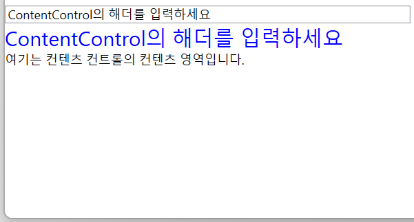
AttachedProperty는 언젠가 사용할 기회가 있을 수도 있다...정도만 기억해 주시면 좋을 것 같습니다.
물론, TextBox 바닥에 '이름을 입력하세요' 등의 메시지를 뿌려주는 용도로도 사용되기는 하지만, 이걸 실제 프로젝트에서 응용해서 원하는 내용을 만드실려면.. 머리 아픕니다.

응용 분야는 기존 컨트롤에 개발자가 원하는 메시지나 값들을 출력하는 용도로 사용할 수 있으며, 저는 상용 그리드 컨트롤 하단에 셀의 계산 결과를 출력하거나, 총 개수 표시 등을 처리할 때 사용했습니다.
더 자세한 사항은 여기를 참고하시면 좋을 것 같습니다.
5. 소스
WpfTest/ElementNameSample at master · kaki104/WpfTest (github.com), WpfTest/SourceSample at master · kaki104/WpfTest (github.com)
GitHub - kaki104/WpfTest
Contribute to kaki104/WpfTest development by creating an account on GitHub.
github.com
'WPF .NET' 카테고리의 다른 글
| MVVM Pattern을 사용하는 개발자를 위한 안내 V1.0 part6 Command (0) | 2022.07.05 |
|---|---|
| MVVM Pattern을 사용하는 개발자를 위한 안내 V1.0 part5 Converter (0) | 2022.06.27 |
| MVVM Pattern을 사용하는 개발자를 위한 안내 V1.0 part4-1 Data Binding (1) | 2022.06.13 |
| MVVM Pattern을 사용하는 개발자를 위한 안내 V1.0 part3-3 (2) | 2022.06.07 |
| MVVM Pattern을 사용하는 개발자를 위한 안내 V1.0 part3-2 (0) | 2022.06.02 |
- Total
- Today
- Yesterday
- uno platform
- WPF
- MVVM
- ComboBox
- #uwp
- C#
- #prism
- XAML
- LINQ
- Build 2016
- ef core
- visual studio 2019
- .net
- IOT
- Always Encrypted
- #MVVM
- uno-platform
- #Windows Template Studio
- dotNETconf
- kiosk
- Bot Framework
- Visual Studio 2022
- UWP
- windows 11
- PRISM
- Cross-platform
- Behavior
- .net 5.0
- Windows 10
- Microsoft
| 일 | 월 | 화 | 수 | 목 | 금 | 토 |
|---|---|---|---|---|---|---|
| 1 | 2 | 3 | 4 | |||
| 5 | 6 | 7 | 8 | 9 | 10 | 11 |
| 12 | 13 | 14 | 15 | 16 | 17 | 18 |
| 19 | 20 | 21 | 22 | 23 | 24 | 25 |
| 26 | 27 | 28 | 29 | 30 |