티스토리 뷰
2022.09.06 - [WPF .NET] - MVVM Pattern을 사용하는 개발자를 위한 안내v1.0 part9-2 StyleSelector
2022.08.31 - [WPF .NET] - MVVM Pattern을 사용하는 개발자를 위한 안내 v1.0 part9-1 DataTemplateSelector
2022.08.08 - [WPF .NET] - MVVM Pattern을 사용하는 개발자를 위한 안내 v1.0 part8-3 Template
2022.08.02 - [WPF .NET] - MVVM Pattern을 사용하는 개발자를 위한 안내 v1.0 part8-2 Template
2022.07.21 - [WPF .NET] - MVVM Pattern을 사용하는 개발자를 위한 안내 v1.0 part8-1 Template
2022.07.13 - [WPF .NET] - MVVM Pattern을 사용하는 개발자를 위한 안내 v1.0 part7 Behavior
2022.07.05 - [WPF .NET] - MVVM Pattern을 사용하는 개발자를 위한 안내 V1.0 part6 Command
2022.06.27 - [WPF .NET] - MVVM Pattern을 사용하는 개발자를 위한 안내 V1.0 part5 Converter
2022.06.15 - [WPF .NET] - MVVM Pattern을 사용하는 개발자를 위한 안내 V1.0 part4-2 Data Binding
2022.06.13 - [WPF .NET] - MVVM Pattern을 사용하는 개발자를 위한 안내 V1.0 part4-1 Data Binding
2022.06.07 - [WPF .NET] - MVVM Pattern을 사용하는 개발자를 위한 안내 V1.0 part3-3
2022.06.02 - [WPF .NET] - MVVM Pattern을 사용하는 개발자를 위한 안내 V1.0 part3-2
2022.05.30 - [WPF .NET] - MVVM Pattern을 사용하는 개발자를 위한 안내 V1.0 part3-1
2022.05.11 - [WPF .NET] - MVVM Pattern을 사용하는 개발자를 위한 안내 v1.0 part2
2022.05.09 - [WPF .NET] - MVVM Pattern을 사용하는 개발자를 위한 안내 v1.0 part1
1. ContentTemplate
ContentControl에 대해서 먼저 알아 보도록 하겠습니다.
셈플 코드
<ContentControl
Grid.Column="2"
VerticalAlignment="Center"
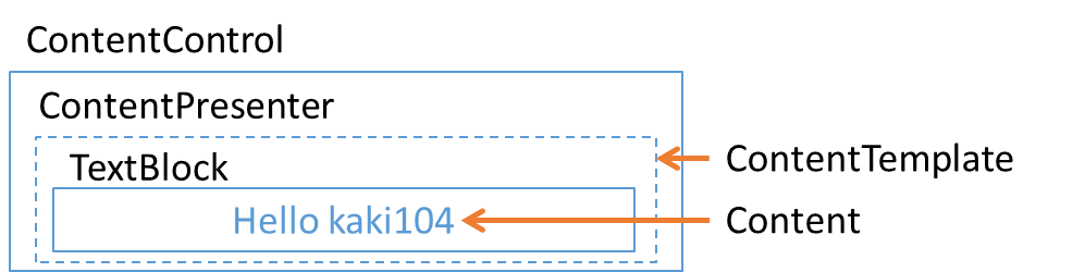
Content="Hello kaki"/>Hello kaki가 출력되는 부분이 ContentControl입니다.
ContentControl의 구조와 특징을 설명하도록 하겠습니다.
.NET 6로 만들어진 WPF 프로젝트에서 확인한 구조입니다. .NET Framework WPF의 ContentControl과 구조가 다를 수 있습니다.
- 단일 데이터를 다양한 형태로 출력하는 컨트롤 입니다.
- TextBlock의 Text 프로퍼티는 string 데이터만 출력할 수 있지만, ContentControl의 Content는 object 데이터를 출력할 수 있습니다.
- Border가 없습니다.
- BorderBrush, BorderThickness를 이용해도 테두리를 표시할 수 없습니다.
- HeaderedContentControl, TabItem, Button, CheckBox 등 Content 프로퍼티를 가지고 있는 대부분의 컨트롤이 ContentControl을 상속받은 컨트롤들입니다.
- 작고, 가볍기 때문에 활용성이 좋습니다.
- 1개의 ContentPresenter만을 가지고 있습니다. ContentPresenter는 ContentTemplate를 이용해서 출력 방법을 정의할 수 있는데, ContentTemplate가 없는 경우에는 string 값은 TextBlock을 이용해서 출력합니다.
- ContentTemplate는 DataTemplate, HierarchicalDataTemplate으로만 정의할 수 있습니다.
작성하고보니 ItemTemplate와 거의 동일한 특징을 가지고 있네요 ^^;;;

2. ContentTemplate 예제
ContentControl을 이용해서 Path Icon들을 출력하는 방법을 자주 사용하고 있습니다. 아래 몇가지 셈플을 추가했습니다.
PathStyle
        <!--  PathStyle  -->
        <Style x:Key="PathStyle" TargetType="Path">
            <Setter Property="Stretch" Value="Uniform" />
            <Setter Property="RenderTransformOrigin" Value="0.5,0.5" />
            <Setter Property="RenderTransform">
                <Setter.Value>
                    <TransformGroup>
                        <TransformGroup.Children>
                            <RotateTransform Angle="0" />
                            <ScaleTransform ScaleX="1" ScaleY="1" />
                        </TransformGroup.Children>
                    </TransformGroup>
                </Setter.Value>
            </Setter>
        </Style>
PathIcons
이미지 아이콘은 크기나 색상에 따라 여러개의 이미지가 필요하지만, Path로 만들어진 아이콘들은 크기 및 컬러 등을 자유롭게 변경할 수 있기 때문에 이미지 아이콘 보다 사용성이 좋습니다.
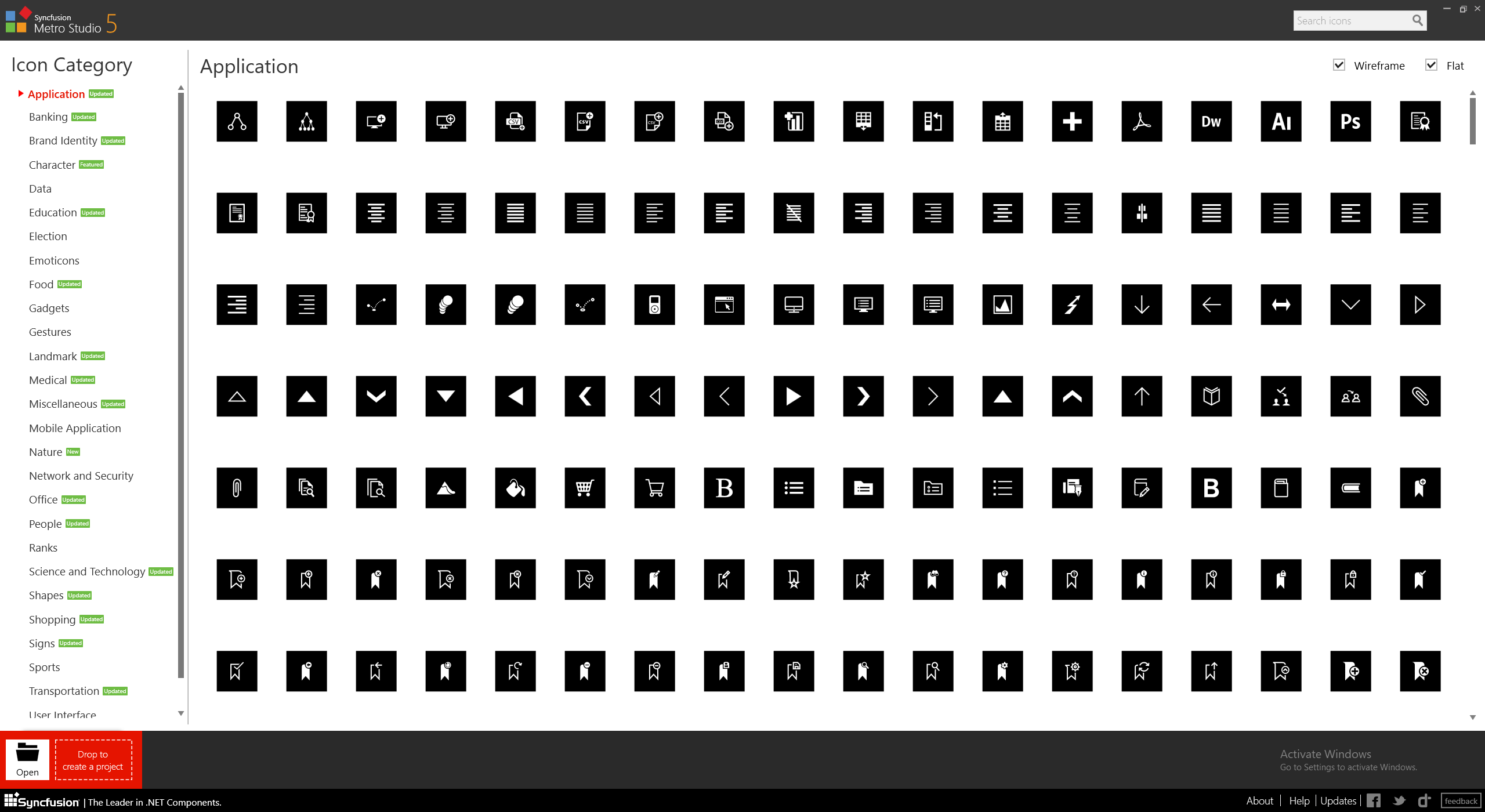
Path 아이콘은 Syncfusion Metro Studio 5를 이용하면 쉽게 구할 수 있습니다.
<!-- PathIcons -->
<DataTemplate x:Key="PathClear">
<Grid>
<Grid.ColumnDefinitions>
<ColumnDefinition Width="30" />
<ColumnDefinition />
</Grid.ColumnDefinitions>
<Grid.RowDefinitions>
<RowDefinition />
<RowDefinition />
</Grid.RowDefinitions>
<Path
Grid.RowSpan="2"
Margin="{Binding RelativeSource={RelativeSource AncestorType=ContentControl}, Path=Padding}"
Data="M1.8002373,17.934131L11.78916,27.92324 32.000004,27.92324 32.000004,30.246261 11.093165,30.246261 11.093165,28.619502 9.0021781,30.711291C8.3051776,31.408257,7.3761987,31.408257,6.6791977,30.711291L1.5682294,25.600219C-0.52274312,23.510173,-0.52274312,20.257152,1.5682294,18.167165z M19.756094,0L29.777014,10.021091 13.843144,25.955203 3.8232168,15.934112z"
Fill="{Binding RelativeSource={RelativeSource AncestorType=ContentControl}, Path=Foreground}"
Style="{StaticResource PathStyle}" />
<TextBlock
Grid.Column="1"
Margin="10,0,0,0"
Text="{Binding Name}" />
<TextBlock
Grid.Row="1"
Grid.Column="1"
Margin="10,0,0,0"
Text="{Binding Description}" />
</Grid>
</DataTemplate>
<DataTemplate x:Key="PathAdd">
<StackPanel>
<Path
Margin="{Binding RelativeSource={RelativeSource AncestorType=ContentControl}, Path=Padding}"
Data="M0,11.605016L3.6729971,11.605016 3.6729971,18.52201 28.327011,18.52201 28.327011,11.605016 32.000002,11.605016 32.000002,22.193002 28.327011,22.193002 3.6729971,22.193002 0,22.193002z M14.148006,0L17.848003,0.0029907228 17.848003,5.4570027 23.307005,5.4590169 23.304006,9.1570168 17.848003,9.1579934 17.848003,14.614019 14.148006,14.616003 14.148006,9.1579934 8.6930026,9.1600076 8.6930026,5.4559956 14.148006,5.4570027z"
Fill="{Binding RelativeSource={RelativeSource AncestorType=ContentControl}, Path=Foreground}"
Style="{StaticResource PathStyle}" />
<TextBlock
HorizontalAlignment="Center"
VerticalAlignment="Center"
Text="{Binding}" />
</StackPanel>
</DataTemplate>
<DataTemplate x:Key="PathDelete">
<StackPanel HorizontalAlignment="Center" Orientation="Horizontal">
<Path
Margin="{Binding RelativeSource={RelativeSource AncestorType=ContentControl}, Path=Padding}"
Data="M3.7399902,0L16,12.258972 28.26001,0 32,3.7399902 19.73999,16 32,28.258972 28.26001,32 16,19.73999 3.7399902,32 0,28.258972 12.26001,16 0,3.7399902z"
Fill="{Binding RelativeSource={RelativeSource AncestorType=ContentControl}, Path=Foreground}"
Style="{StaticResource PathStyle}" />
<TextBlock
Margin="10,0,0,0"
VerticalAlignment="Center"
Text="{Binding}" />
</StackPanel>
</DataTemplate>
<DataTemplate x:Key="PathSave">
<StackPanel HorizontalAlignment="Center" Orientation="Horizontal">
<Path
Margin="{Binding RelativeSource={RelativeSource AncestorType=ContentControl}, Path=Padding}"
Data="M5.4189969,24.678986L5.4189969,27.915009 26.188982,27.915009 26.188982,24.678986z M8.2970601,0.038998604L12.289056,0.038998604 12.289056,8.1850023 8.2970601,8.1850023z M0,0L5.2730013,0 5.2730013,9.7799988 26.188982,9.7799988 26.188982,0 31.653999,0 31.653999,32 0,32z"
Fill="{Binding RelativeSource={RelativeSource AncestorType=ContentControl}, Path=Foreground}"
Style="{StaticResource PathStyle}" />
<TextBlock
Margin="10,0,0,0"
VerticalAlignment="Center"
Text="{Binding}" />
</StackPanel>
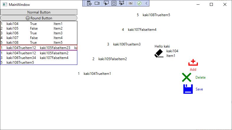
</DataTemplate>ContentControl에 아이콘 적용
x:Name PersonContentControl에는 코드 비하인드에서 Content에 Person 데이터를 입력합니다.
        <StackPanel Grid.Column="2" VerticalAlignment="Center">
            <ContentControl Content="Hello kaki" />
            <ContentControl x:Name="PersonContentControl" ContentTemplate="{StaticResource PathClear}" />
            <ContentControl
                Padding="4"
                Content="Add"
                ContentTemplate="{StaticResource PathAdd}"
                Foreground="Red" />
            <ContentControl
                Padding="4"
                Content="Delete"
                ContentTemplate="{StaticResource PathDelete}"
                Foreground="Green" />
            <ContentControl
                Margin="4"
                Content="Save"
                ContentTemplate="{StaticResource PathSave}"
                Foreground="Blue" />
        </StackPanel>
실행 결과
3. Template 마무리
이제 Template의 설명은 완료가 된 것 같습니다. 요즘은 낮에 코딩한다고 정신이 없어서 포스팅을 작성할 시간이 별로 없내요 그래서 계속 늦어지고 있습니다. 흐흐;;

4. 소스
WpfTest/TemplateSample at master · kaki104/WpfTest (github.com)
GitHub - kaki104/WpfTest
Contribute to kaki104/WpfTest development by creating an account on GitHub.
github.com
'WPF .NET' 카테고리의 다른 글
| MVVM Pattern을 사용하는 개발자를 위한 안내v1.0 part9-2 StyleSelector (0) | 2022.09.06 |
|---|---|
| MVVM Pattern을 사용하는 개발자를 위한 안내 v1.0 part9-1 DataTemplateSelector (3) | 2022.08.31 |
| MVVM Pattern을 사용하는 개발자를 위한 안내 v1.0 part8-2 Template (2) | 2022.08.02 |
| MVVM Pattern을 사용하는 개발자를 위한 안내 v1.0 part8-1 Template (0) | 2022.07.21 |
| MVVM Pattern을 사용하는 개발자를 위한 안내 v1.0 part7 Behavior (4) | 2022.07.13 |
- Total
- Today
- Yesterday
- #Windows Template Studio
- XAML
- visual studio 2019
- uno-platform
- ef core
- .net 5.0
- #prism
- Microsoft
- Always Encrypted
- Windows 10
- Behavior
- Cross-platform
- UWP
- WPF
- #uwp
- IOT
- windows 11
- C#
- dotNETconf
- MVVM
- kiosk
- .net
- #MVVM
- Visual Studio 2022
- uno platform
- Build 2016
- Bot Framework
- PRISM
- ComboBox
- LINQ
| 일 | 월 | 화 | 수 | 목 | 금 | 토 |
|---|---|---|---|---|---|---|
| 1 | 2 | 3 | 4 | |||
| 5 | 6 | 7 | 8 | 9 | 10 | 11 |
| 12 | 13 | 14 | 15 | 16 | 17 | 18 |
| 19 | 20 | 21 | 22 | 23 | 24 | 25 |
| 26 | 27 | 28 | 29 | 30 |